- Client
- Biosort
- Sector
- Aquaculture
- Services
- Brand Identity & Design
Fish friendly folks
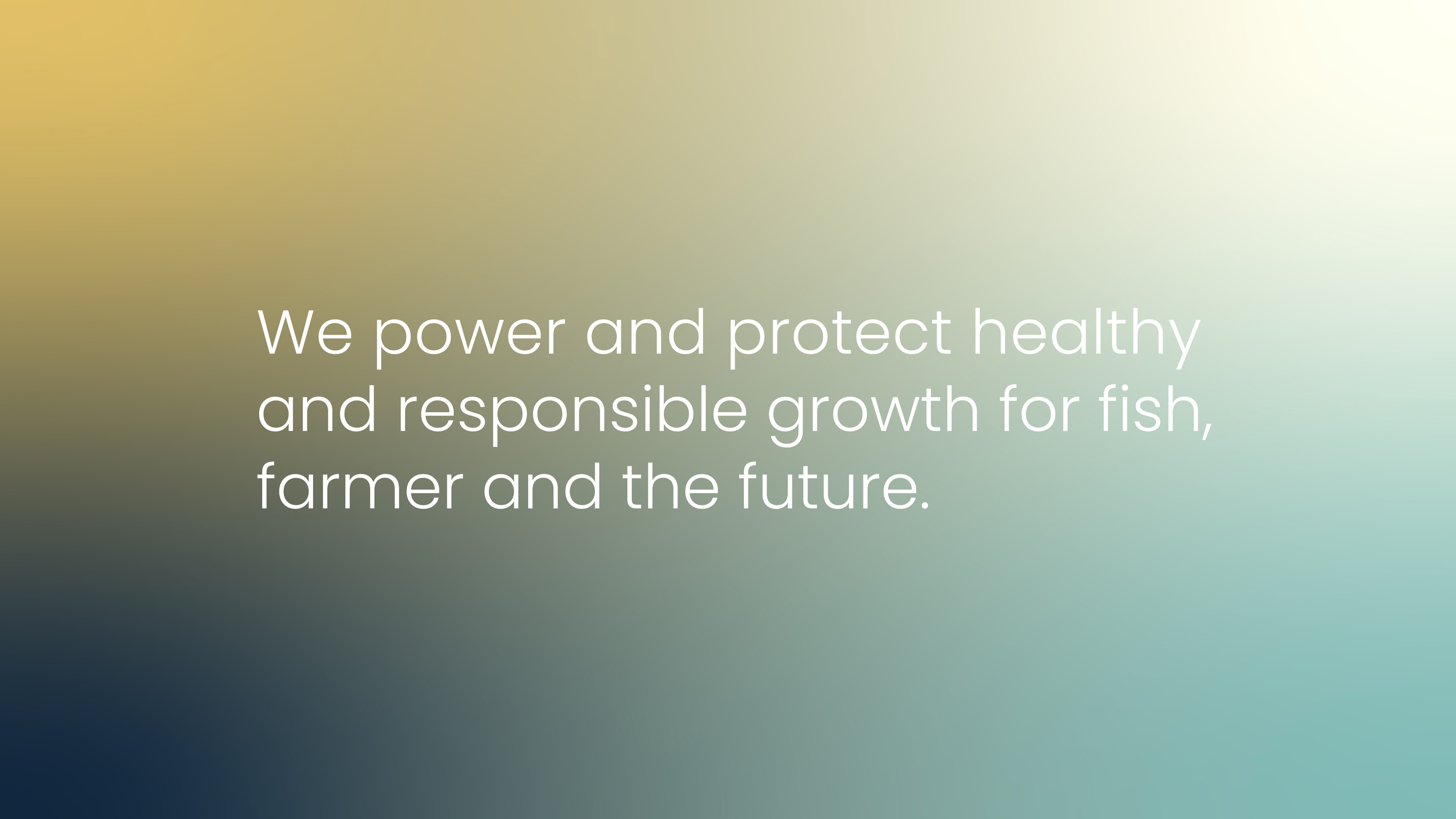
Biosort powers and protects healthy and responsible growth for fish, farmer and the future – for a more sustainable aquaculture.
Biosort aims to become the preferred provider of sensor systems for aquaculture. With a major milestone approaching, and a pivot and new product underway, it was crucial to establish a clear, future-oriented visual identity and digital presence aligned with the company’s strategy and ambitions.
Challenge
Biosort needed a distinctive visual identity and website to strengthen its market position. The brand had to stand out in a technology-driven industry while remaining human, credible, and future-oriented.
Our approach
Through insight work and a Brand Matrix workshop, we defined a brand personality that is ambitious yet responsible, technically strong yet approachable. This balance guided the creative direction across identity, colors, and communication.
Solution
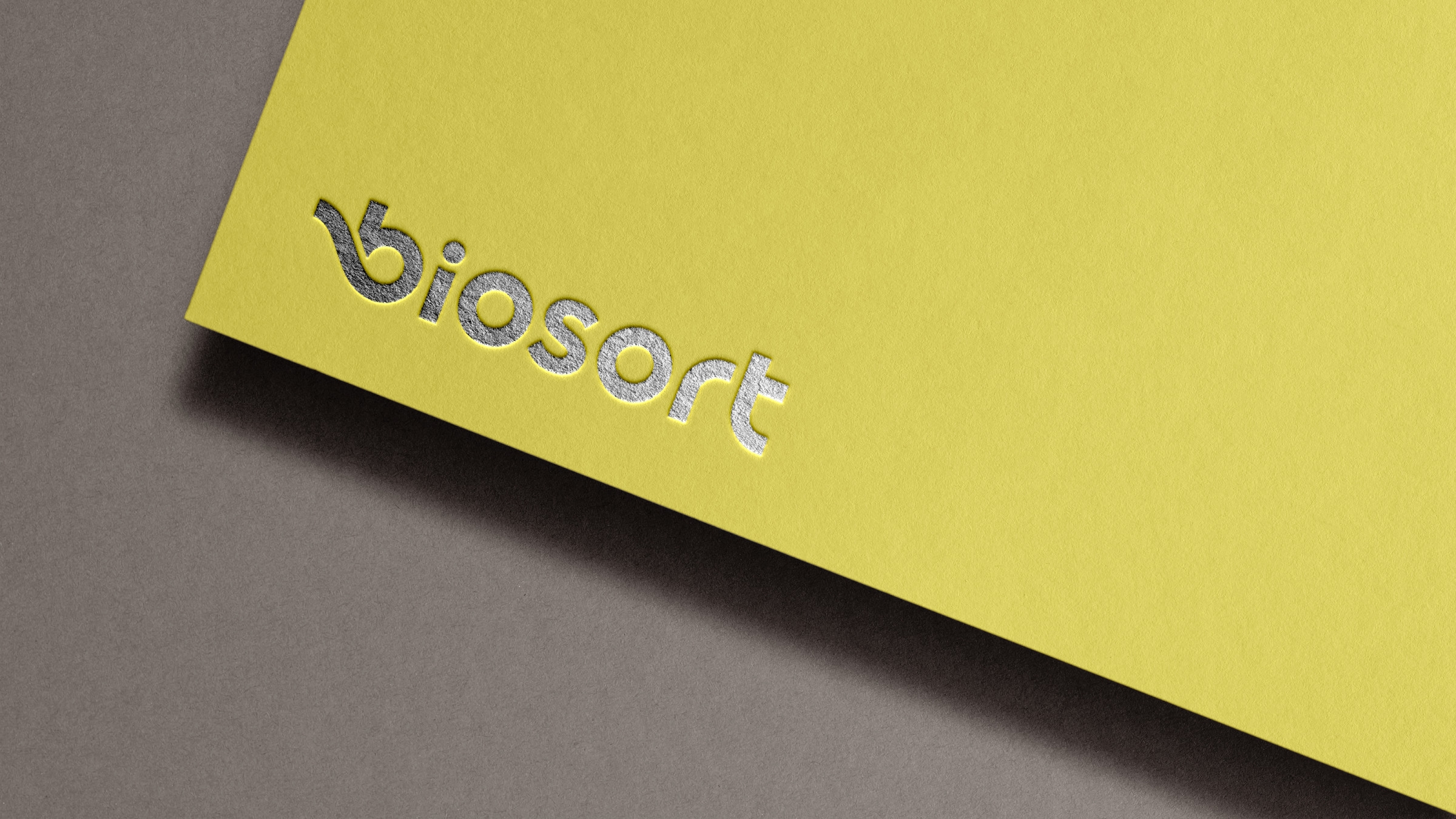
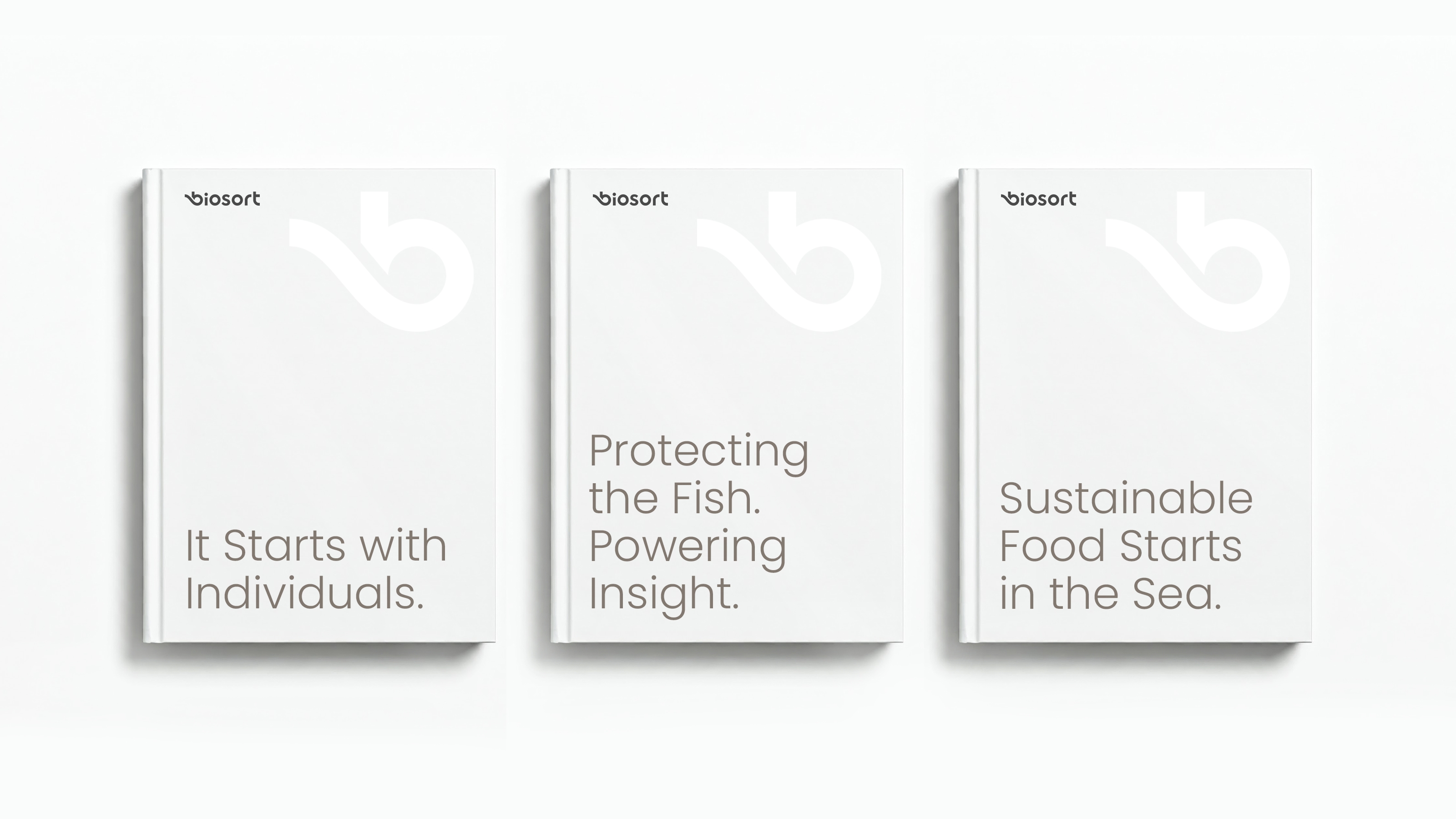
We redesigned the logo around a clean, circular “o” whose wave form flows into the “b”, linking the letters and evoking water, precision, and respect for nature. A bold yellow paired with ocean-inspired tones creates a warm, memorable identity that makes advanced technology feel personal and trustworthy. The new Biosort website reflects the ambition and responsibility – it’s technically strong yet approachable, and feels both personal and authentic.
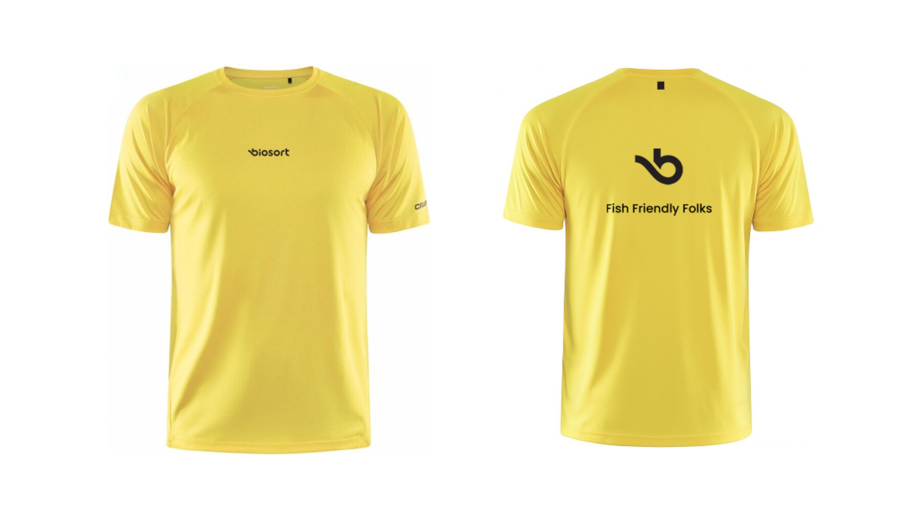
The logo was completely redesigned and now consists of a wordmark with a characteristic “o” shape that conveys a modern, technical feel. The wave form evokes a sense of water and aquaculture, suggesting both precision and technology, while its soft, organic lines emphasize respect for nature. The logo communicates high technological expertise without appearing cold and builds emotional resonance within the aquaculture sector. It signals responsibility, sustainability, and animal welfare – inspiring trust. The use of a lowercase “b” gives the brand a softer, more inviting appearance than a capital “B”. A simple, compact “b” functions well as an icon, app logo, and favicon – a complementary element to the wordmark. Using lowercase lends the brand a more human and relatable feel.
The palette
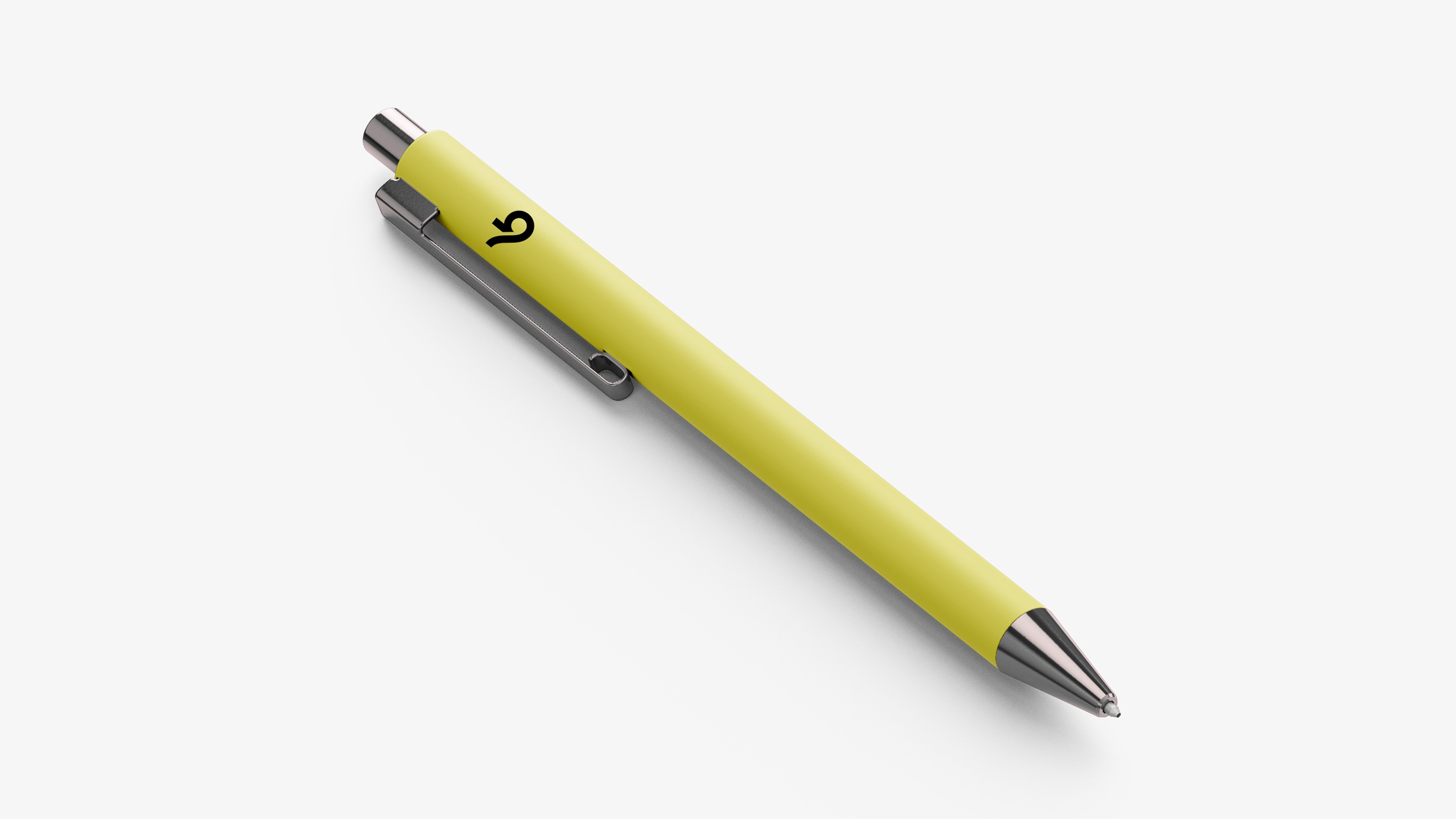
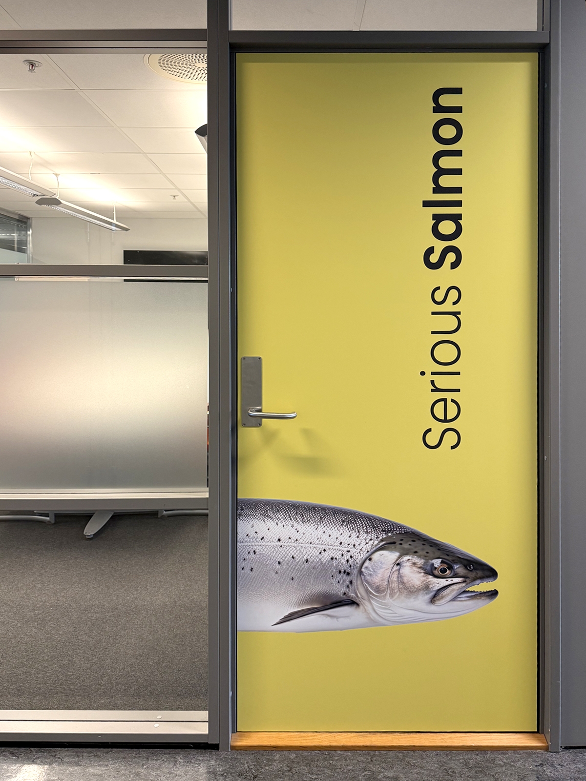
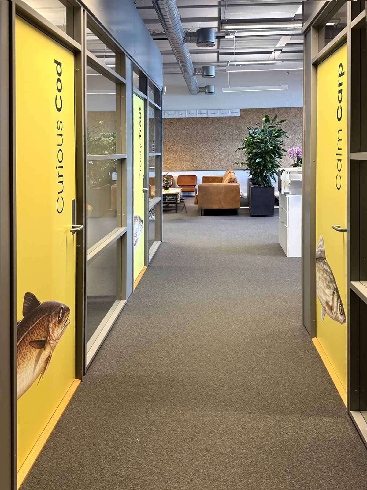
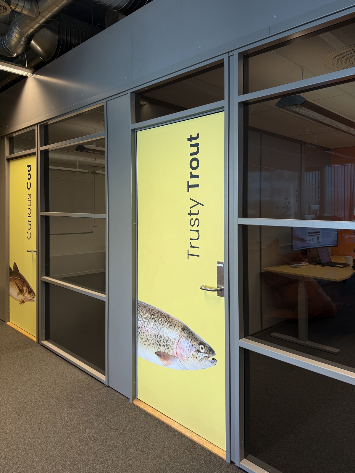
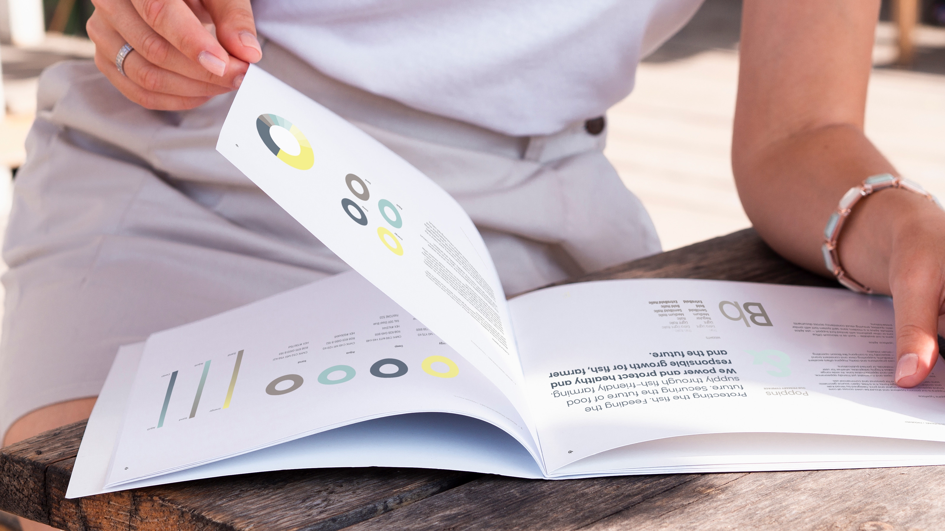
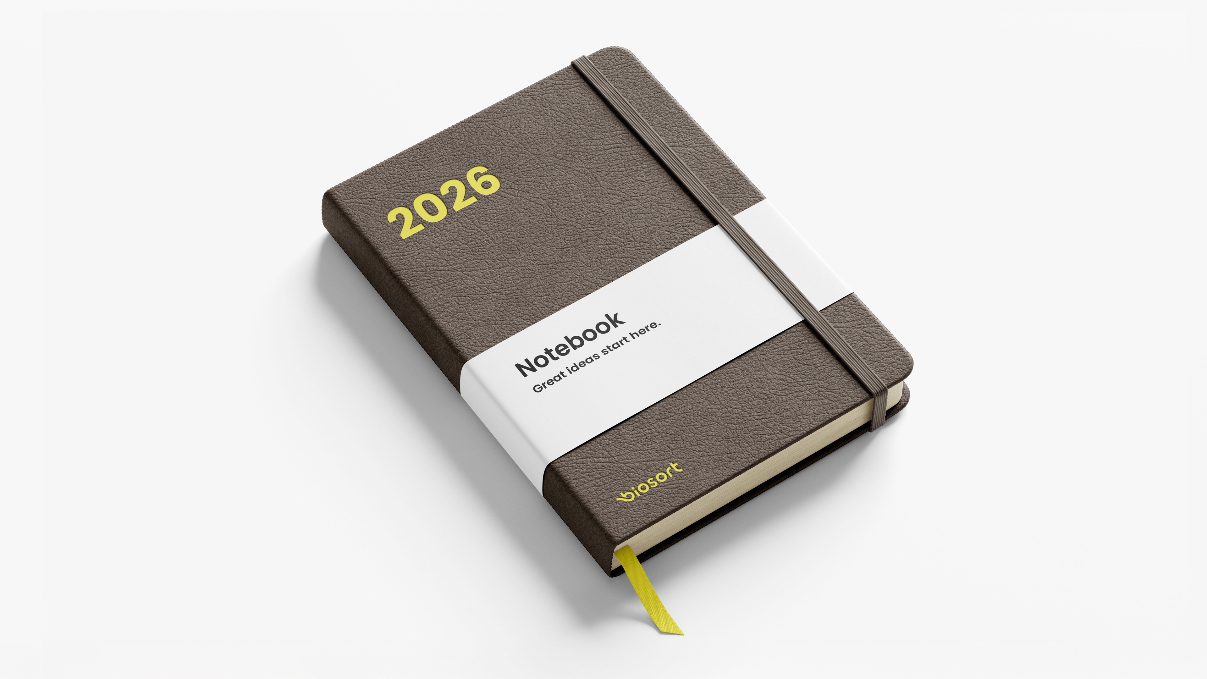
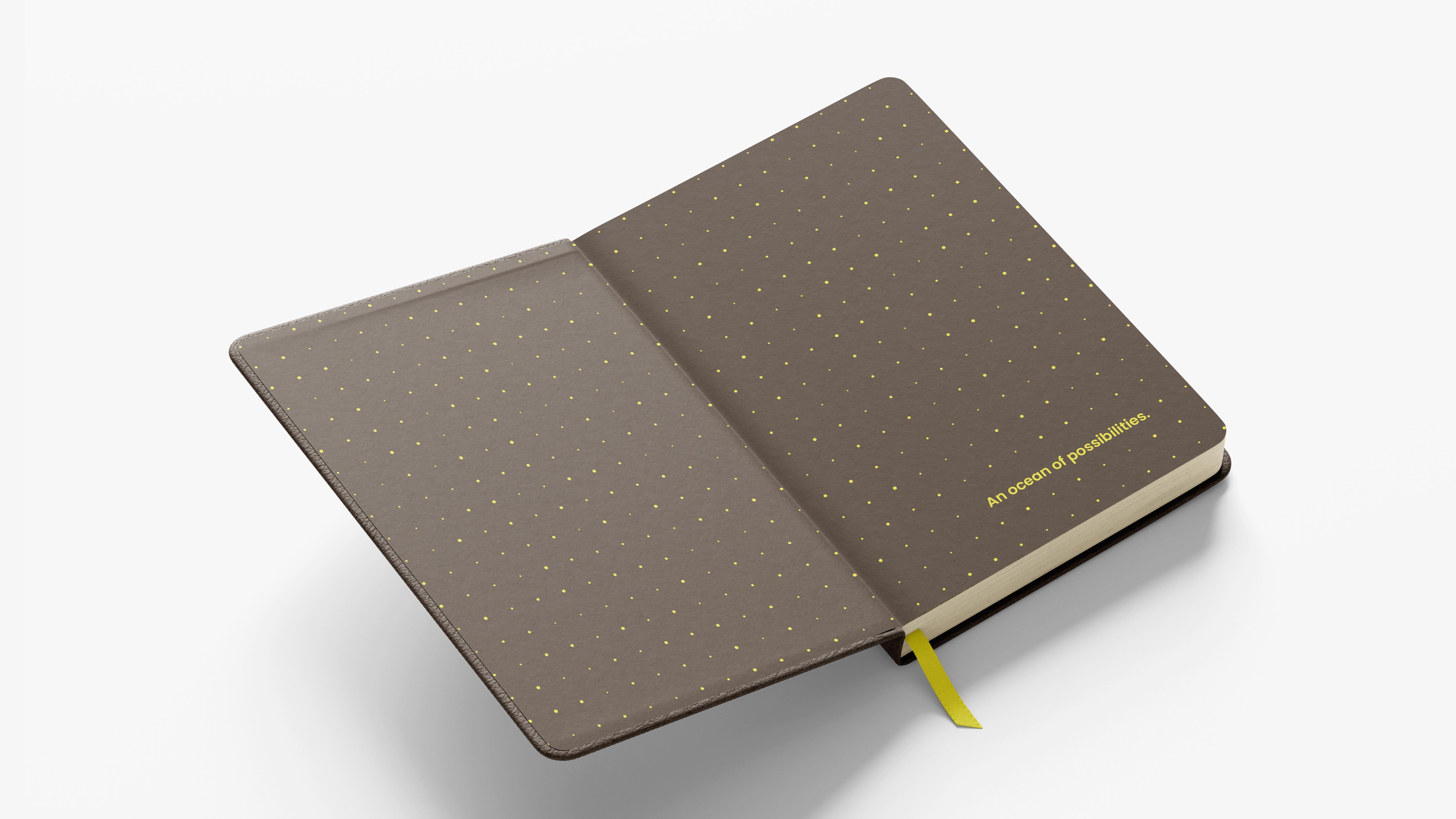
While the industry color palette is traditionally blue and green, Biosort’s primary color is a bold yellow – a bright, energetic, and stimulating hue often associated with ideas, creativity, and forward-thinking. Yellow brings natural warmth and friendliness, balancing the colder, technical side of technology – making the brand more human and relational. In an industry dominated by blues and greens, yellow offers a unique and memorable identity – while still pairing well with ocean-inspired support colors like dark blue, sand, white, and black.
Tone of voice
We developed a communication style that balances confidence with humanity – combining precision and technology with warmth, responsibility, and approachability. Biosort is ambitious yet responsible. We lead with expertise but communicate clearly and openly. This is more than technology to us – it’s personal. We speak with clarity and courage, without ever compromising on trust or human insight.
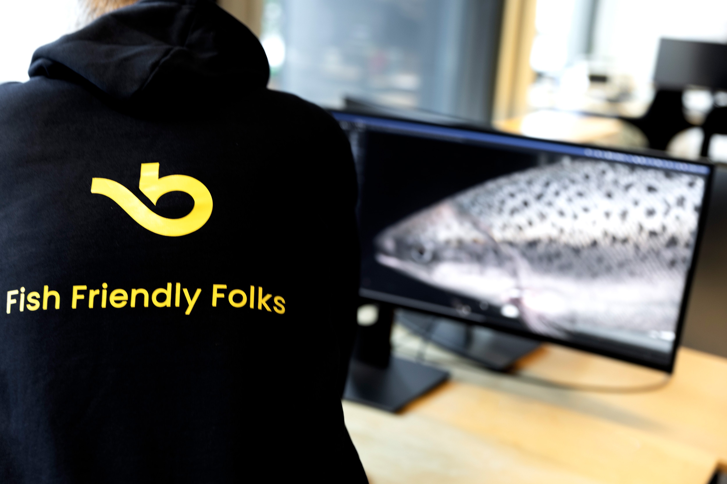



We speak with clarity and courage, without ever compromising on trust or human insight.
— Biosort

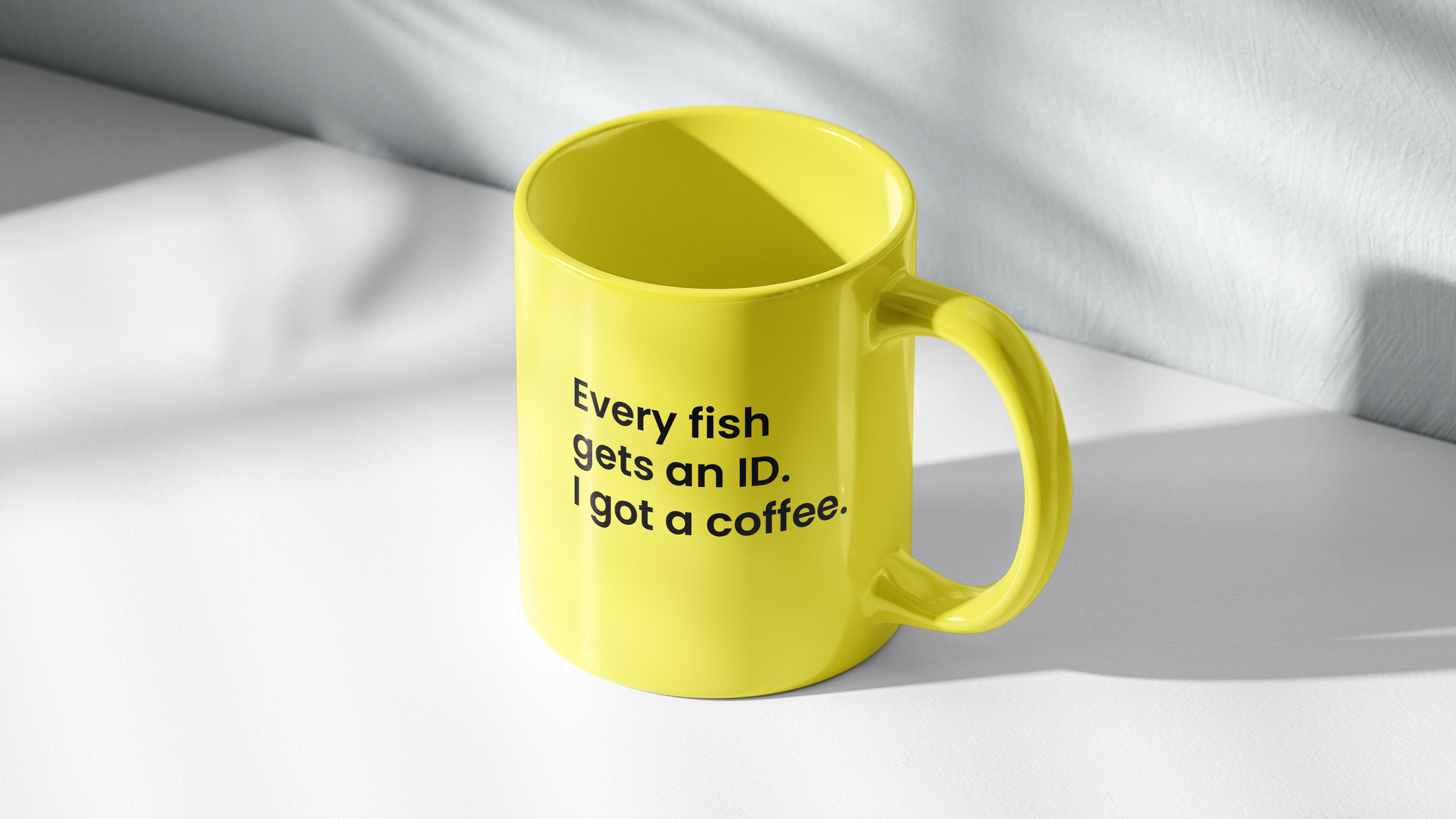
Breaking from the industry’s traditional blues and greens, we chose a vibrant yellow as the primary brand color – symbolizing creativity, optimism, and forward thinking.